Tag Archives: 1996

Designworks 3.5 – Software Overview

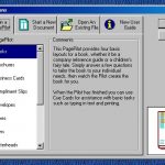
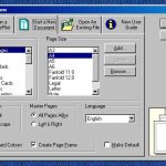
Designworks 3.5 is a desktop publishing suite from 1996 published by GST Technology Ltd. It is a slightly more restricted version of GST Technology’s Pressworks software.

See this article for the previous 3.0 version.

Editor Thoughts

This is certainly a curious application as GST were also producing another desktop publishing suite under the Pressworks name. Why cards, logos and certificates are reserved for Designworks and things such as letterheads and bussiness cards are only available in Pressworks is beyond me. I can only see the reason for this being that GST wanted to make a bit more money out of their customers.

The only real difference between Printworks and Designworks is that Designworks appears to be more aimed towards the creation of graphics.

System Requirements

The software package does not list any system requirements to run the software, although the software is intended to be used with Windows 95.

Changelog / Known Issues

The software includes the following changelog items under the Dwk_read.wri file:

  • Because the internal data structures have changed, the file format has also changed. The program will be able to read old-format files (back to file format 1.02). It will not be able to save files in the old DWK3 format.
  • The File menu has a new entry, Send Mail. This will only be enabled when you have an appropriate mail support installed.
  • The new Windows 95 file selector and new Windows 95 controls have been implemented.
  • The OLE handler, which provides improved display and print quality for Designworks objects embedded in other programs, can be enabled/disabled using the Preferences dialog box.
  • New Windows 95 right-click behaviour has been introduced, as required for Logo compliance.
  • Three Help menu entries have moved to the Options menu. These are ToolTips, Getting Started Hints and Cue Cards.
  • Right-click on the Windows 95 desktop to create a new Designworks picture.
  • New Windows 95 Help with context-sensitive Help available on dialog boxes has been included.
  • Centimetres are now the default unit of measurement.
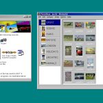
  • Clipart Browser can now be launched from the PagePilots.
  • The display and print performance has been improved.

Extras

The software includes some samples including:

  • 1,200 clip-art images in CGM format.

Gallery

Further Reading


Test Information

Software was tested and installed from an ISO copy of The Multimedia Variety Pack.

Software was run under Microsoft Windows 98SE running in a VMWare Workstation 15 environment with the following spec:

  • 256MB RAM
  • 10GB HDD
  • VMWare SVGA II graphics adapter at a resolution of 1280 by 960
  • VMWare sound card with Creative Sound Blaster driver loaded

Around 2 hours have been dedicated so far to the testing of this application.

Pressworks 2.5 – Software Overview

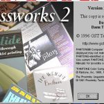
Pressworks 2.5 is a desktop publishing suite from 1996 published by GST Technology Ltd. It comprises of seven main applications:

  • Clipart Browser
    A basic clip-art browser utility used to arrange and organize WMF image files.
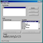
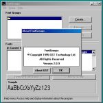
  • FontGroups
    A basic utility to arrange and organise font files.
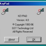
  • KeyPad
    A character map utility for inserting special characters.
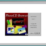
  • PhotoCD Browser
    A basic utility used to view Photo CD’s.
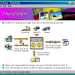
  • PhotoEditor
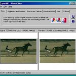
    A very simple Photo editing and manipulation tool, including a photo album utility.
  • Pressworks 2.5
    A desktop publishing application with various templates allowing you to create books, brochures, business cards, compliment slips, envelopes, faxes, flyers, letterheads, memos, newsletters, notices and reports.
  • SnapShot
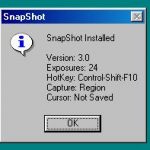
    A screenshot utility which allows the user to take screenshots of their screen, active window or a specific region.

The software also includes demos for Border Creator 1.0 and Designworks 3.

Editor’s Thoughts

There are probably a dozen desktop publishers that exist from this era of Windows. Of course many of you probably are familiar with Microsoft’s own Publisher application or the offerings from Adobe with Illustrator, but there were many other small software development houses that existed who were also trying to get a piece of the pie.

Admittedly desktop publishers for me aren’t very interesting. Sure being a kid I used to spend hours with them making books, flyers, calendars and other useless materials in the name of wasting paper and ink – but as an adult I find little enjoyment with these applications unless they include something very unique and special. Pressworks certainly includes a lot of things and appears to be pretty capable for making basic documents with fancy text and graphics. Being from 1996 the software certainly has a very 90s aesthetic to the design language applied to many of the pre-made templates so the software could serve as useful for anyone wanting to tap into some nostalgia when making some stationery.

The software comes with a variety of utilities as well – most of them being small organisers for things like clip-art, photos and fonts. Most of these are very basic and simply exist to allow you to put the various items into simple groups. The most useful utility  that is included is SnapShot; which acts like a very rudimentary snipping tool with the ability to take screenshots of active windows or regions and then save those to bitmap, PCX or TIFF images.

System Requirements

The software package does not list any system requirements to run the software, although the software is intended to be used with Windows 3.1 or Windows 95.

Changelog / Known Issues

The software doesn’t include any changelog or known issues. A SETTINGS.TXT file is also included to advise on how to amend the software INI file to enable / disable additional features.

While testing the software in a VMWare virtual machine we experienced no faults or issues when running the software under Microsoft Windows 98 SE.

Extras

The software includes some samples including:

  • 35 fonts in TrueType format
  • 100 photos in JPEG format
  • 104 clip-art images in WMF format
  • 100 template files in DTP format

Gallery

Further Reading


Test Information

Software was tested and installed from an ISO copy of The Multimedia Variety Pack.

Software was run under Microsoft Windows 98SE running in a VMWare Workstation 15 environment with the following spec:

  • 256MB RAM
  • 10GB HDD
  • VMWare SVGA II graphics adapter at a resolution of 1280 by 960
  • VMWare sound card with Creative Sound Blaster driver loaded

Around 2 hours have been dedicated so far to the testing of this application.

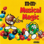
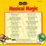
Musical Magic (M&Ms)

Artist – Various artists
Release Year – 1996
Record Label –
Michele Compact Discs
Format – CD compilation
Promoting 
– M&Ms chocolate sweets/chocolate candy
Theme – Classical music

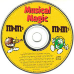
This might be one of the only promotional releases that I picked up in 2018 that wasn’t part of a haul, as I have been spending the year buying items to fill out my musical knowledge more than scratch my promotional item itch. As soon as I slid this CD out from a very shaky bookcase in my local charity shop I fell in love with the wonderful 90s aesthetic of the M&M characters and design of this ultimately rather mediocre release. These days we are treated to gaudy looking CGI characters with silly New York style accents but there is something oh so sweet about these little mascots that are seen here on the front of this release.

M&M’s, like many items of confectionery in the UK could be classed as being aimed towards more children, or have a playful nature about them. So why in 1996 Mars (the brand owner) decided to give away a 16 track compilation of classical hits with the sweets I am unsure. Performing a loose search on YouTube of “M&Ms 1996” to retrieve examples of commercials or promotions that were happening at the time returns nothing of the sort; actually it was in this period that Mars began to use CGI voiced characters with those stereotypical New York accents – with no sign of class or pomp in sight. A few cautionary Google searches brings up no results either to explain the thinking behind this kind of promotion.

Normally with many of these releases it makes sense, the music found on the CD works with the demographic or style of the product/brand being promoted. Classical music compilations would normally show up on classy products such as whisky, alcohol or upmarket department stores – not colourful shelled chocolates.

Utterly mind boggling, if anyone has any insight as to why or how this CD came to exist please let me know.

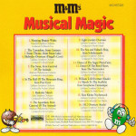
Tracklist

  1. Volograd Symphony Orchestra – Sleeping Beauty Waltz
  2. Ljubljana Symphony Orchestra – The Toreadors, from Carmen
  3. Ljubljana Symphony Orchestra – Swan Theme, from Swan Lake
  4. Ljubljana Symphony Orchestra – Hebrides Overture (Fingal’s Cave)
  5. American Philharmonia Orchestra – The Swan, from Carnival of the Animals
  6. Ljubljana Symphony Orchestra – In The Hall of the Mountain King, from Peer Gynt
  7. Sofia Symphony Orchestra – Radetsky March
  8. American Philarmonia Orchestra – The Aquarium, from Carnival of the Animals
  9. Ljubljana Symphony Orchestra – Light Cavalry Overture
  10. Ljubljana Symphony Orchestra – The Sea and Sinbad’s Ship, from Scheherazade
  11. Ljubljana Symphony Orchestra – Dance of the Sugar Plum Fairy
  12. Ljubljana Symphony Orchestra – Dance of the Reed Flutes, from The Nutcracker
  13. Ljubljana Symphony Orchestra – William Tell Overture (finale)
  14. Ljubljana Symphony Orchestra – March to the Scaffold, from Symphonie Fantastique
  15. Ljubljana Symphony Orchestra – Eine Kleine Nachtmusik
  16. Ljubljana Symphony Orchestra – 1812 Overture (finale)

Gallery

MTV Home Video Beavis and Butthead Video Collection Inlay Promotion (1996)

I found this promotion in Beavis and Butthead Chicks N’ Stuff (VHR 4358).

The inlay advertises the following items:

Videos

Video Games

  • Beavis and Butthead Virtual Stupidity (mis-spelt as Vitual Stupidity)

Gallery

’56 Ford Pick-Up (Metallic Blue) – Matchbox Model

I don’t recall when I got this model. The year of copyright on the base is 1996, but I feel that I bought this car with pocket money well into the 2000’s. Either way, I have had this model for a serious amount of time.

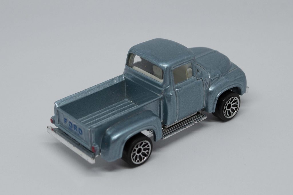
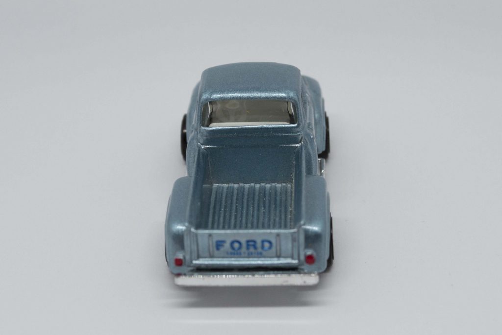
Rear/Side

Considering the amount of time I have owned this model, there are barely any signs of play. The axles are straight and all wheels roll freely. Paint work is in great condition with no chips or scratches. The plastic glass on the window has a few very fine marks, but otherwise clear. There is only a small crack in the base plastic that forms the side step for the passenger door.

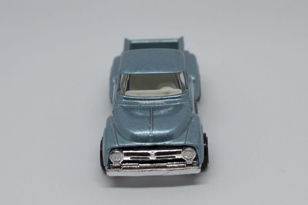
Front

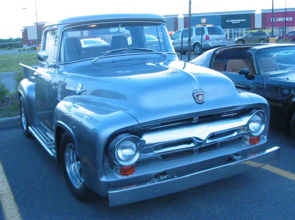
The model is of a 1956 Ford F100 Pick-up, however the base simply refers to it as ‘Pick-up’. I likely bought the car amongst my phase of being a self-confessed muscle car nut – which is surprising with the little amount of knowledge I have of the cars. In recent years I have seen a fair few F100’s at shows here in the UK and they certainly have a road presence. Although probably not one of my first choices to own from the line of American pick-ups, you can’t deny the styling of the F100 is wonderfully brilliant for what is a farm truck. Most F100’s these days have taken on a life of glamour, leaving the dusty and smelly farm work behind them – this model seems to represent the new life for many F100’s.

The model features a beautiful blue metallic paint that sparkles in the light, really catches your eye. Paired with a gleaming ‘chrome’ effect bumper and side steps, which are part of the base plate, the model looks to be worth more than it is on first glance.

Rear

Surprisingly for a toy there is a considerable amount of detail found on this model. The embossed Ford badge on the tailgate is painted in a slightly darker shade of blue with a simple discreet decal above it. Along with this we have painted headlamps and taillights. The bed features ridges and is big enough that you could fit some small items in it (such as scale appropriate barrels or animals). Moving forwards towards the front of the car the model has minute details such as a petrol filler cap (present on the passenger side), door handles, cabin vents and handles to release the hood. The front grille is nicely formed as to stand away from the body of the car, giving the front of the model a nice 3D look.

The models interior is plastic and white in colour. Visibility into the cabin is possible by the 2 crystal clear windows (windscreen and rear window) along with two quarter windows for each passenger. However the cabin lacks detail with only a bench seat and basic steering wheel mould present.

Underside

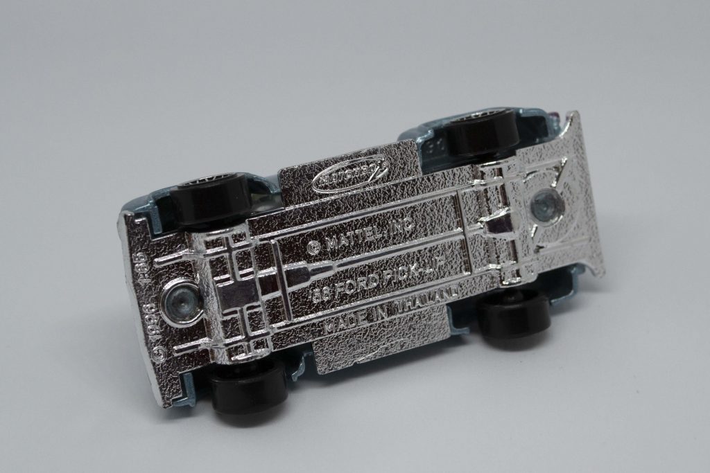
The model doesn’t feature any kind of suspension, so bent axles are a potential hazard with this model. Much like its real life counterpart the model doesn’t sit very high from the ground, giving an almost low-rider effect. The four Matchbox branded plastic wheels spin freely and independently on two axles. These wide plastic wheels fill out the wide flared arches of the body nicely.

As with many Matchbox vehicles the base plate is made from plastic, but in this case has been painted a sparkly silver colour. The base plate also is nicely moulded with mouldings for sump, transmission, driveshaft, differential, spare tire and basic chassis structure. The base is riveted to the die-cast body with two rivets, one at the front and one at the back.

A real 1956 Ford F-100 Pick-up

This model of mine doesn’t require any restoration. It fits in nicely with dioramas with hot rod/muscle car themes. As it is likely I purchased this model late in my life, this is probably the reason for its high quality condition.
Model Status – In Collection 

Model Details

Model Manufacturer Matchbox
Model Scale 1/65 (?)
Year of Manufacture/Copyright 1996
Country of Manufacture Thailand
Model of 1956 Ford F100 Pick-Up
Identifiers none
Variant/Speciality Not a special variant
Colour Blue, metallic
Decals Very fine decal on the tailgate
Feature no feature
Body Material Die-cast metal
Base Material Plastic
Base Colour Silver (sparkly)
Interior Material Plastic
Interior Colour White
Glass Colour Clear
Wheel Material/Style Plastic/Matchbox branded multi-spoke
Suspension No